The Tomatin Redesign and the Joy of a New Coat of Paint

Tomatin whisky has a new packaging redesign.
The Highland distillery’s refresher is purely aethestic, the whisky remains the same. The outside, however, has had a proper wardrobe rethink.
That’s not unusual these days. Scotch packaging refreshes have become almost routine. You might remember some of Tomatin’s previous efforts. Some land brilliantly. Some cause a minor panic among loyal drinkers who suddenly don’t recognise their beloved bottle.
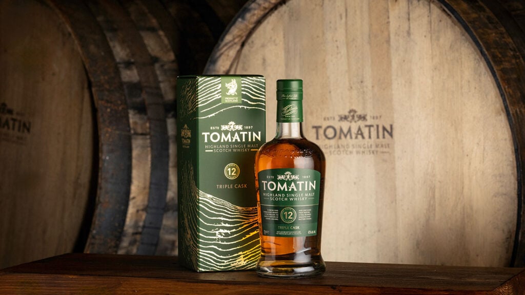
It’s now: Tomatin 12 Year Old Triple Cask
Wood, front and centre
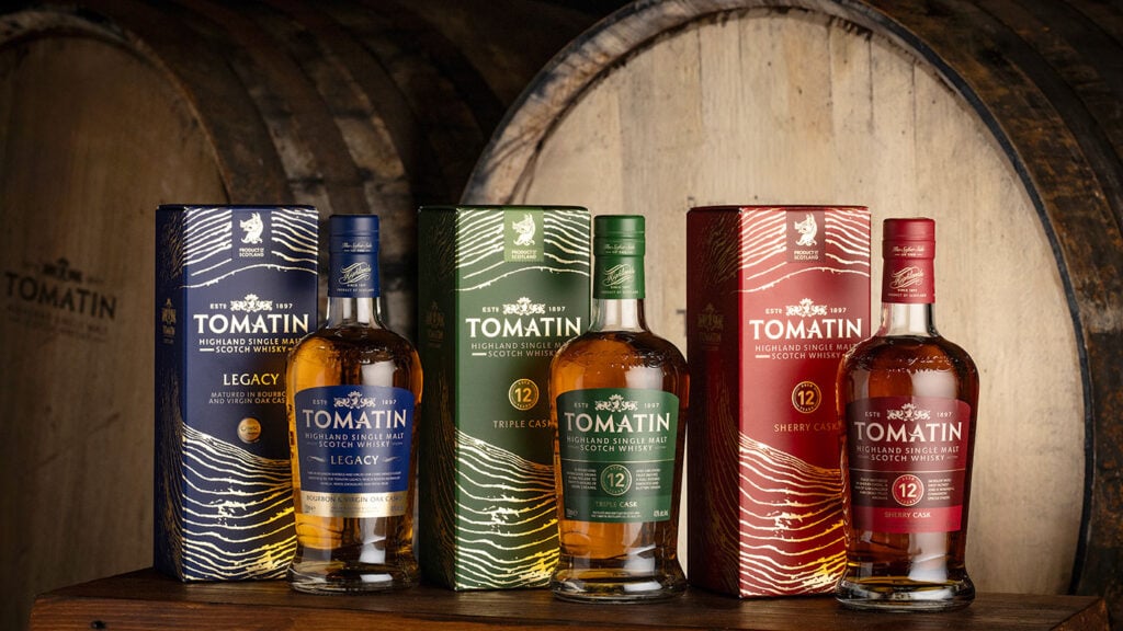
The most obvious feature of the redesign is a wood-grain motif on the presentation box. The pattern mirrors the rings found in oak trees, a visual nod to the role casks play in shaping the whisky.
Tomatin has long leaned into its reputation for careful cask management, as the distillery is one of the relatively small number in Scotland with its own on-site cooperage. The distillery’s cooper, Allan Bartlett, even picked up Cooper of the Year at the 2025 Icons of Whisky Awards.
The new packaging makes that story easier to spot. What is whisky without wood, folks?
A new look for Highland whisky maker, Tomatin Distillery
A clearer range
The Tomatin redesign also adds simpler labels and bolder colours. Each expression now carries its own palette, from indigo and forest green to scarlet and teal. You’ll see these on a back bar.
The names have been clarified, too. The familiar Tomatin 12 Year Old now appears as Tomatin 12 Year Old Triple Cask, highlighting how the whisky is matured rather than leaving the detail buried on the label.
The bottle shape from the 2014 redesign is maintained, so it’s not a total departure. The Tomatin redesign doesn’t try to reinvent anything. It simply gives the range a clearer, more confident look and ties the visual identity back to the casks. It’s a neat job.
What are your favourite redesigns? Do brands get them right more often than not? And are most redesigns even necessary? Let us know your thoughts in the comments below.