

The Glenfiddich redesign is here. Come take a look.
The Speyside distillery has given itself a refresh, drawing heavily on cues from its own archive. Helpfully, the press release includes the following picture (below) so you can see the development of the brand’s aesthetic over its 139-year history.


See here how the design has changed over generations
Back to the 1960s, baby
The redesign takes inspiration from the 1960s, the period when Glenfiddich helped establish single malt Scotch whisky as a distinct international category. At a time when blends dominated exports, Glenfiddich invested in promoting single malt abroad, particularly in the United States. That commercial shift changed the trajectory of Scotch whisky.
Visually, the 1960s also cemented several enduring brand signifiers, most notably the stag. It has appeared on Glenfiddich bottles since the 1960s and was originally inspired by Sir Edwin Landseer’s 1851 painting The Monarch of the Glen. In the updated design, the stag has drawn with more depth and movement, framed by the founding date of 1887.
The wordmark has also been adjusted. A sans-serif typeface replaces earlier iterations. There’s also a refreshed Grant Family Crest embossed within the new packaging, alongside the family motto, Stand Fast. Glenfiddich remains one of the largest family-owned whisky distilleries in Scotland. William Grant founded the distillery in 1887, and the company continues under Grant family ownership today.

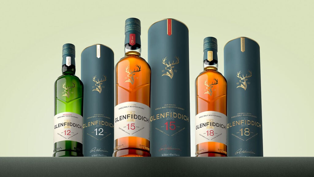
Take it all in: The new Glenfiddich look
A measured evolution
Operationally, little changes. The whisky is still distilled in Speyside using water from the Robbie Dhu spring. The house style, known for orchard fruit, malt sweetness and a relatively clean profile, remains under the direction of sixth malt master Brian Kinsman.
Kinsman has emphasised that innovation has always played a role at Glenfiddich, from early export ambitions to more recent cask finishes and experimental releases. That tension between consistency and experimentation sits at the heart of the brand’s identity. The brand is also juggling a competitive and ruthless global whisky market. With little room for error, established distilleries face the challenge of remaining contemporary without diluting credibility. It’s a tough gig.
Hence, the new Glenfiddich redesign. It’s all very clean, very simple. There is more white space, more textural detail, and a clearer hierarchy across packaging. Some would call it elegant, while others might find it a little boring. Personally, I prefer the older styles, but it’s all a game of opinions. The new look will certainly be easy to see on a back bar or a supermarket shelf. The age statements certainly are.
The new packaging will roll out globally from April 2026. What do you make of it?